
Whenever I do a background with my paints, no matter what technique I am doing, I always use three coordinating colours.
If you always use coordinating colours then you will always get a good result, even if you make a mess of it.
Unfortunately not everyone knows what colours coordinate together, so here's a little step out to help you all.

Lemon Zest, Fresh Lime, Cut Grass

Fresh Lime, Cut Grass, Vibrant Turquoise

Fresh Lime, Cut Grass, London Blue

Cut Grass, Vibrant Turquoise, London Blue.

Vibrant Turquoise, London Blue, Crushed Grape.

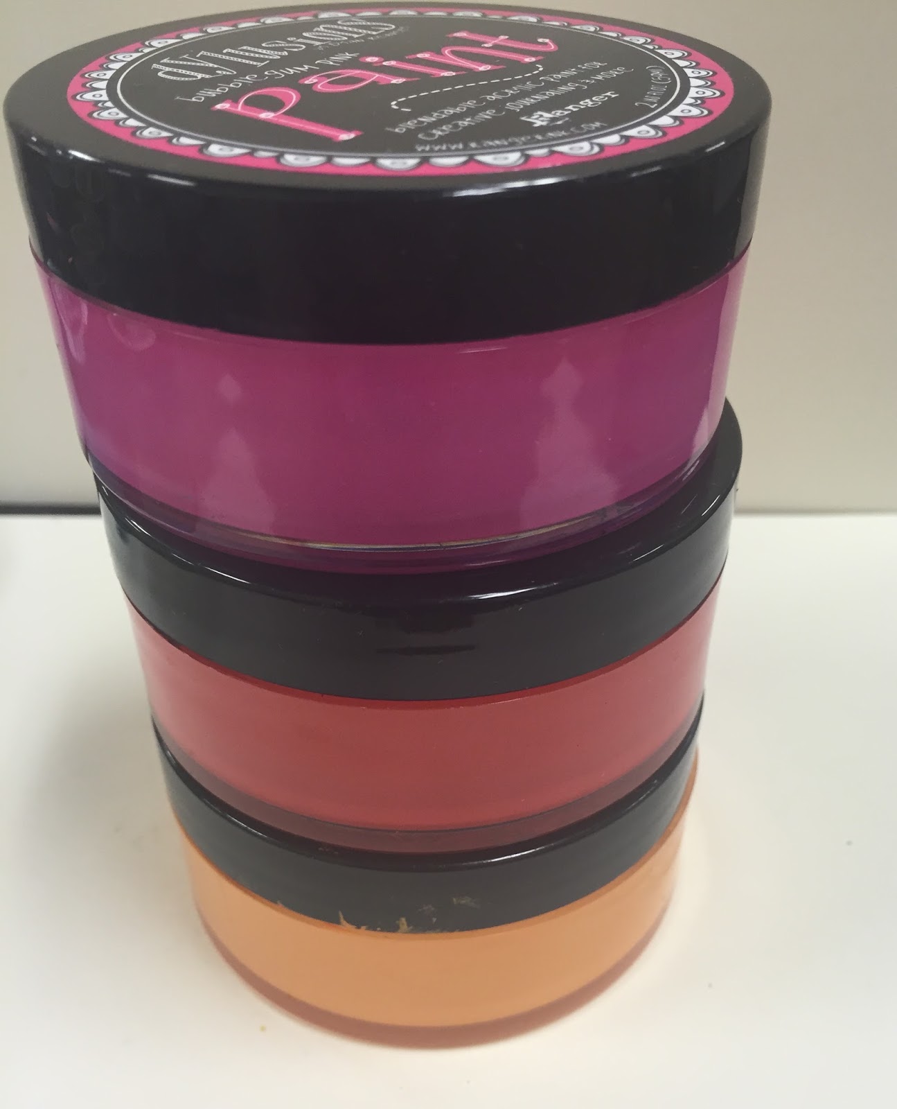
Bubblegum Pink, Crushed Grape, Vibrant Turquoise.

Bubblegum Pink, Postbox Red, Crushed Grape.
Squeezed Orange, Postbox Red, Bubblegum Pink

Squeezed Orange, Postbox Red, Melted Chocolate.

Lemon Zest, Squeezed Orange, Melted Chocolate.

Lemon Zest, Squeezed Orange, Postbox Red
I also get asked all the time which colours are the no no colours, meaning the ones when mixed together make brown.
These are opposites on the colour wheel and I would never use them together wet.
But if you let them dry they are fabulous for complementing each other and making them pop.
So wet is a no no, dry is a yes yes...

The opposite of Crushed Grape is Lemon Zest and Fresh Lime, and vice versa.

The opposite of Squeezed Orange is London Blue and Vibrant Turquoise and vice versa.

The opposite of Postbox Red is Cut Grass and Fresh Lime and vice versa.
I hope that helped, happy painting.
Enjoy xx
Thank you so much ... I love you for sharing this!!!
ReplyDeleteThank you sooo much! I seem to have a problem with color coordination, even with a color wheel handy. Thank you for this it will help tremendously!!!
ReplyDeleteThank you for the very colorful spreadsheet!
ReplyDeleteThank you so much. This was really helpful to me.
ReplyDeleteThank you for this! Loved your class in Moline on Saturday. What white pen did you say you use on your paint?
ReplyDeleteThank you for this great colour combination tutorial! I've just started an art journal page with Bubblegum Pink and Crushed Grape and was wondering with which colour to make some details. Now I know and is one of my favourite colours! Thank you!
ReplyDeleteLove love love your colours. I spend hours and hours playing. :) Any chance you will release the next 12 colours in the paint soon?
ReplyDeleteBrilliant, thank-you, this is such a useful reference guide. Denyse x
ReplyDeleteThanks dyan! I will try these colors and have a cuppa Yorkshire Gold!
ReplyDeleteLoving the pictures to aid the very educational post today, thank you x
ReplyDeleteThanx so much! This is valuable information! I am in love with these paints & I am also an ink spray addict!!! LOL. Happy Day! Khara
ReplyDeleteThanks Dyan. Now I can enjoy your fab paints even more! Whithout being scared of making is muddy brown pool ;-)
ReplyDeleteGreat information, Dyan! The key to avoiding a lot of the mess is to dry first. I know that, I just forget!! Thanks for the reminder!
ReplyDeleteAwesome help, thanks Dyan :)
ReplyDeleteThank you so much for this useful information. Now I finally know how to coordinate your dylusion paints! Awesome post!!!...h.
ReplyDeleteThis made me smile! Hope you're fairing well.
ReplyDeleteAbsolutely brillant!
ReplyDeleteThanks so much, Dyan. In a busy world stealing every second of ART time I can....very helpful!!
ReplyDeleteHi Dyan Thankyou for this "lesson" i have all your paints but somehow never get to play with the chocolate brown colour, today is the day to start!!!
ReplyDeleteBest Wishes to you all at AFTH X
Thanks Dyan! Is there a colour chart for your paints I can fill in myself?
ReplyDeleteCan we get an update on color combinations with the 6 new colors included please :)
ReplyDeletethis is perfect - thanks for the help and of course your talent
ReplyDeleteYou are the best!
ReplyDeleteThanks so much for posting this. I just ordered several of your paints and this will help me a great deal when I start in my new Dylusions journal!
ReplyDeleteThank you for this invaluable info. Your paints are so beautiful I wouldn’t want to waste them so this info is just perfect
ReplyDelete